Que ce soit pour une impression sur une pièce de vos équipements ou sur vos articles, on peut devenir partenaires.
On offre aussi l'entreposage de vos pièces.
Contactez-nous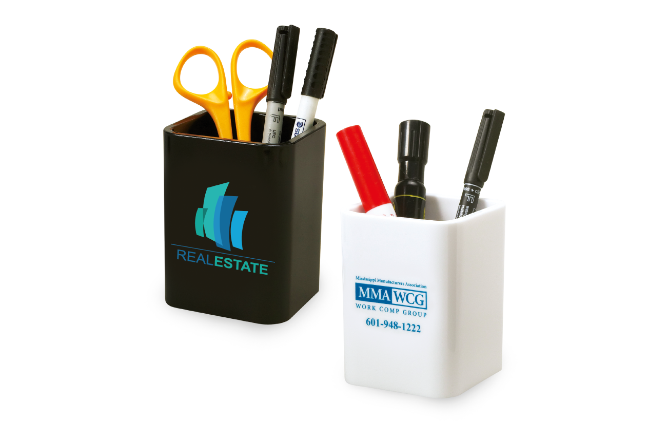
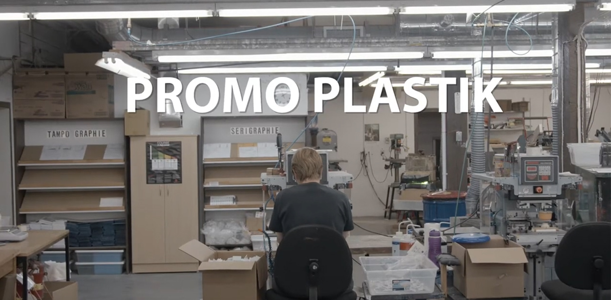
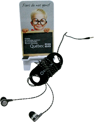
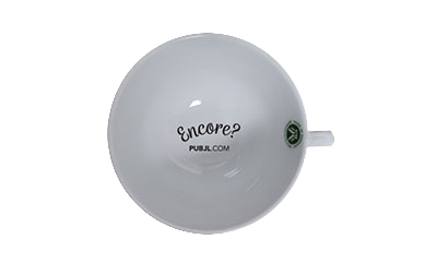
Via notre réseau de distributeurs, on offre des objets promotionnels durables.
Voir les produits
Nos prix incluent déjà les frais de montage.
On aime rendre les objets beaux.
L'impression, c'est dans notre sang!
DÉCOUVREZ-EN PLUS SUR NOUS!


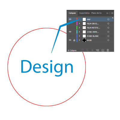
Nos fichiers PDF ont été créés avec Adobe Illustrator. Ils comprennent plusieurs calques. Voici l’explication de leur utilisation.
Voici un rapide aperçu de notre utilisation de 12 attributs mentionnés dans un rapport.
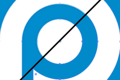
Les images peuvent être de différents types. Les deux principaux sont les images matricielles et les images vectorielles. Ils codent les informations
On reçoit de nombreuses communications où certaines se démarquent du lot. Dans notre coopérative, ce mois-ci, c’est le cas de l’éditorial de...