Que ce soit pour une impression sur une pièce de vos équipements ou sur vos articles, on peut devenir partenaires.
On offre aussi l'entreposage de vos pièces.
Contactez-nous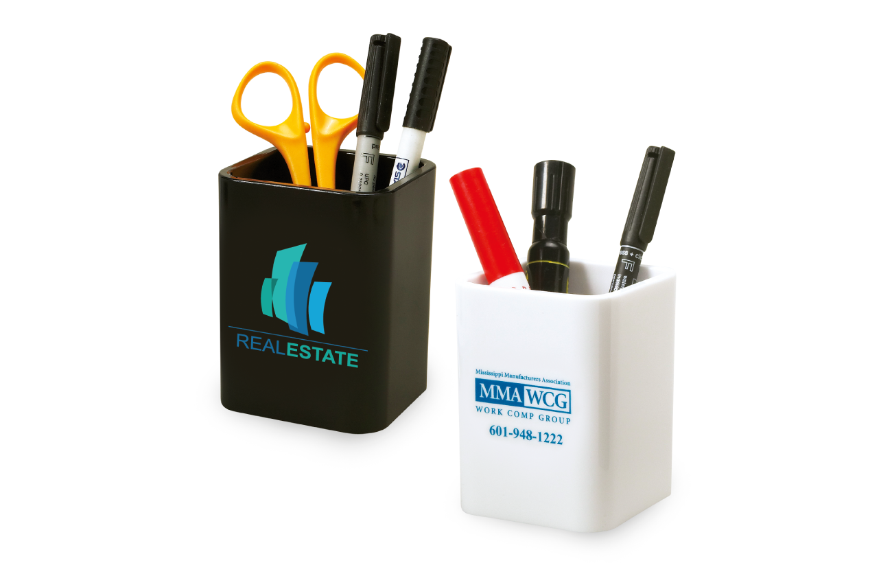
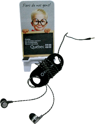
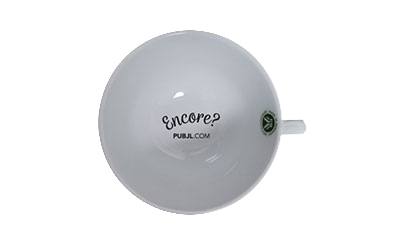
Via notre réseau de distributeurs, on offre des objets promotionnels durables.
Voir les produits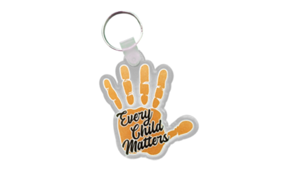
Nos prix incluent déjà les frais de montage.
On aime rendre les objets beaux.
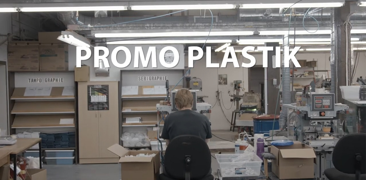
L'impression, c'est dans notre sang!
DÉCOUVREZ-EN PLUS SUR NOUS!


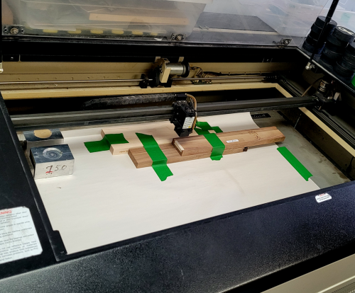
Nous sommes des imprimeurs. Pour les objets que nous imprimons numériquement, nous avons des gabarits différents pour chaque produit.
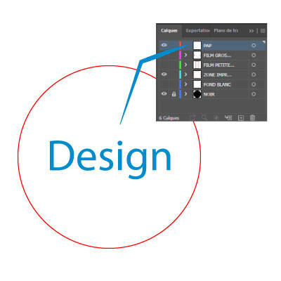
Nos fichiers PDF ont été créés avec Adobe Illustrator. Ils comprennent plusieurs calques. Voici l’explication de leur utilisation.
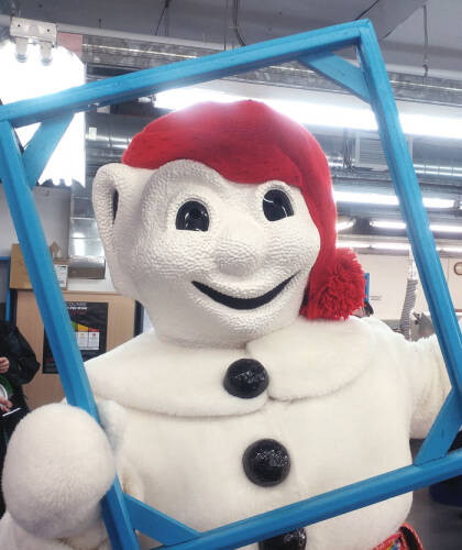
Nous collaborons avec le Carnaval de Québec pour son effigie. L’effigie est le laissez-passer obligatoire pour accéder aux activités du carnaval.
Les gens aiment les couleurs ! Ils en choisissent une ou plusieurs pour leur marque afin de la diffuser partout.