File elements
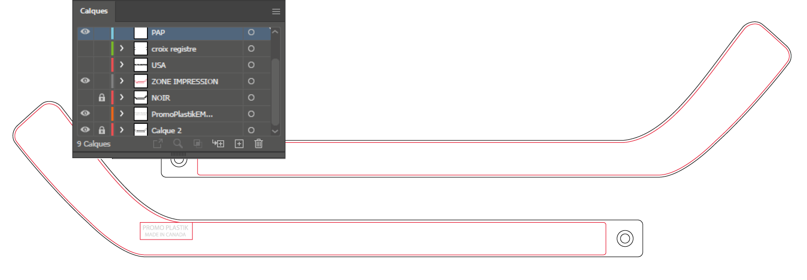
Our PDF files were created with Adobe Illustrator. They include a few layers. Here are the explanation of their use.
See bottom of the page for color specification.
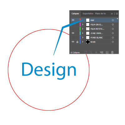
PAP
That’s the layer where you must place your design.
Text, logo/illustration must be vectorized in the files you’re sending to us.
Photos should be high quality ones (300 ppi) when they are placed in your design. They should be embedded.
Read our article about artworks
Zone d’impression / Print Area
It’s the print zone. Our items are almost bleed, but they’re not. Then, your design shouldn’t go outside that zone.
In license plate frame templates, they’re named zone de centrage or zone entière.
If needed, to be sure your design is placed inside that zone, copy the shape and paste it in the PAP layer. And create a clipping mask with that copied shape.
Product layer
Normally, that’s the layer at the bottom of the layers. It’s simply the product shape.
They are created at 100%.
Color name layers
A few of our items are available in a range of color. We create a layer for each color.
Click on the first column to hide or see the color you have chosen, to see the contrast of your design on the right color.
Croix registre / Film
It’s information we use to print film. You don’t have to play with it, but we need it!
Only move your design in the PAP layer. Don’t move any other elements to be sure those marks stay at the right place!
Exceptional Layer
Sometimes, we have other layers that give additional information.
On the hockey stick example (top), it’s to see the embossed text on the stick’s back. You can place color on that (digital only), but don’t place text on it!
Some license plate frame templates have a trou layer to add additional holes.
If you have a white design, don’t place shape under to create a fake transparency: it increases error risk while working with your design for the film or imposition. For the same reason, don’t place shape over shape if you have a complex one: the best way is to use pathfinder to create it.
Also, be extremely careful with fine details : be sure that at 100%, you have enough space to distinguish each from another to be sure your print will be beautiful.
Colors
The type of color you should use depends on your imprint method. Here’s the specification for each we offer.
Pad printing / Silkscreen printing
PMS color
Please use Pantone Solid Coated library and take your PMS number swatch.
No gradient: it must be solid color.
Digital printing (4 color process)
CMYK color
(PMS should be converted to CMYK: you can use Pantone Bridge Coated library (they’re CMYK color) to get an idea of the conversion instead of the Pantone solid one.)
You can make a gradient of color.
You can also print in 1 color only, even like black or white.
Never use RVB colors!
Always make your document in CMYK color mode.
For the black, use the swatch (0,0,0,100) in CMYK swatches. Never convert your RVB black (#000000) directly to CMYK: it gives a black with values like (91,79,62,97) where you will have too much ink to have a beautiful print! For the same reason, never make a black with (100, 100, 100, 100): if you really want an enhanced black (only available in digital), use the receipt (30, 40, 30, 100).
For the white, be sure to use (0,0,0,0).

