


People like colors! They choose one or many for their branding to spread it everywhere. To be sure those colors stay the same, you probably have chosen a PMS color. But when it’s time to print, you may hear that we will convert your PMS color to CMYK. Why? Wasn’t it supposed to be your chosen color? So, we’ll explain why things must be done that way.
Colors, a huge world!
Before we talk about conversions, we must understand colors, how it works.
Lights are composed of different lenghtwaves and will hit objects. Objects absorb some lengthwaves and reflect others to our retina. Our brain interpretes those lengthwaves as a color.
To create a color, there’s an additive synthesis and a subtractive synthesis. Afraid of those terms? We’re pretty sure you’ll relate to their primary colors! Let’s check both.
Additive synthesis

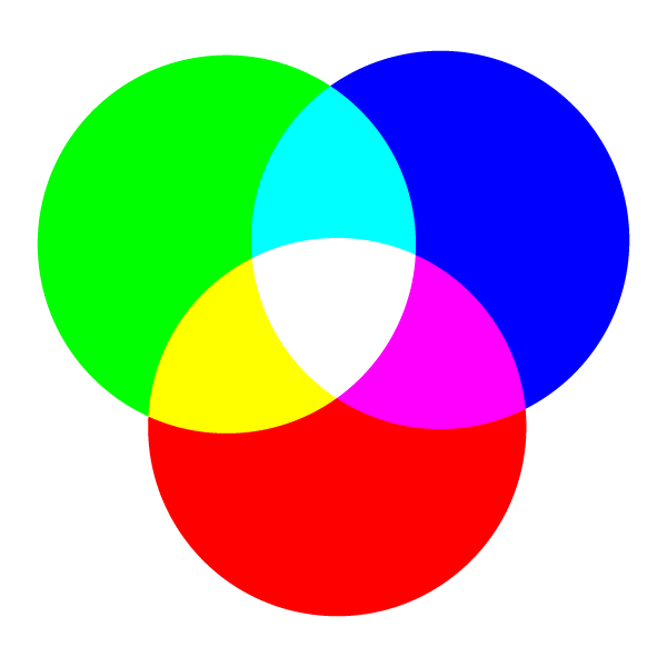
In additive synthesis, the colors are produced by a superposition of lights.
When all lights are superposed and are reflected to our retina, we see a white. And when no light is reflecting, it gives black, like in the night.
The primary colors of this synthesis are red, green and blue (RGB). Additive synthesis is used in computers. So, you’re currently reading in RGB!
Subtractive synthesis

Color mode: CMYK
In subtractive synthesis, colors are generally produced by pigments. Even if we add pigments on surface, this is called substractive synthesis because pigments absorb a part of the spectrum and somewhat remove reflection of lights.
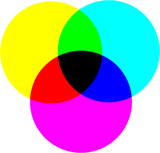
The ideal pigments colors there are cyan, magenta and yellow, and are called subtractive primaries. When you add those colors, it gives black, because all wavelenghts are then absorbed.
Cyan + Magenta + Yellow gives black! Why do we add a black to print in CMYK?
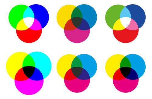
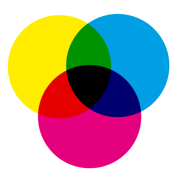
If you’re looking at the images, you see the document created in CMYK color mode produces a more fade black than the one in RGB color mode. Ink transparency has imperfection. It’s one reason why we must add a black ink to overcome this lack.
 Color mode: RGB

They’re linked together!
When yellow ink is putted on your item, it absorbs the blue gammas and reflect the red and green ones.
Have you seen that in the additive synthesis, superposition of red and green makes yellow? All is linked!
Why a conversion of Pantone?
So, as we add pigments on a surface when we are printing with Pantone colors, we use the subtractive synthesis. But, why are we talking about a conversion when printing in digital?
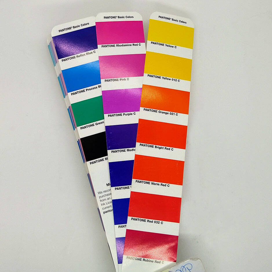
Digital equipment pigments are cyan, magenta, yellow and black. But the Pantone company has its own pigments: for the solid one, 18 basic colors and a transparent white. You see the formula for mixing them next to each swatch on the Pantone Solid Coated guide set.
Because they are not the same pigments of the digital ones, we must convert Pantone colors.
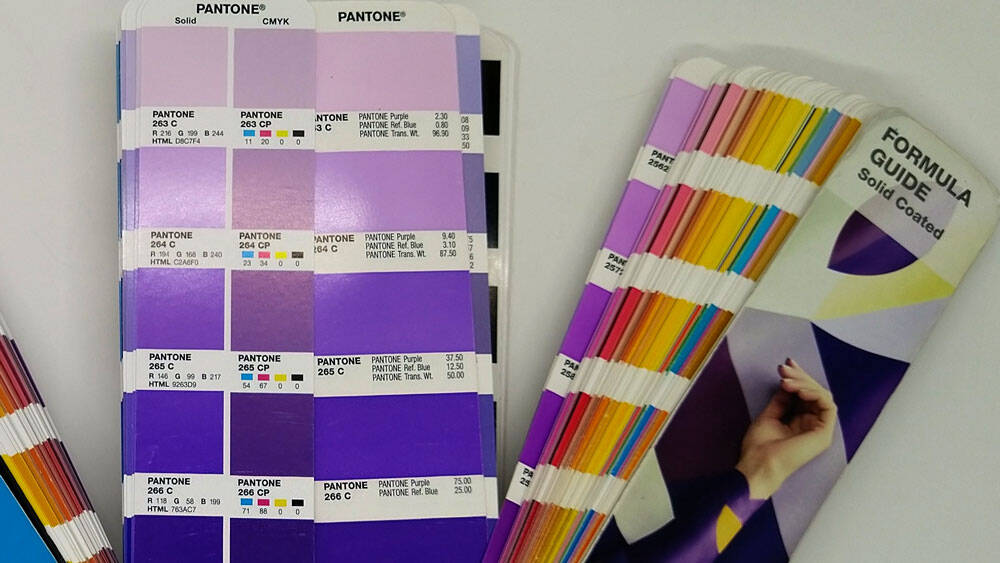
Why then PMS is chosen as a referential color? PMS refers to Pantone matching system. All that means is that it’s a referal system. So, Pantone creates guides that everyone around can follow to match their mixture, with the pigments according to each guide.
It’s similar to paints. Each banner has its pigments and a formula guide to create each color: each store follows the banner guide to create the paint with the banner pigments.
In print, different guides exist (even eco-friendly one!): Pantone’s guides are commonly used, mainly the Solid ones. Even Pantone has guides for CMYK color, and it differs from its Solid ones. Some painting companies have even created charts to match PMS, coming as close as they can with their paint pigments!
An underlayer
When an item is colored, it means that pigments are already in its composition and they absorb lenghtwaves instead of reflecting them. When pigments are placed over, those under continue to absorb a part of the spectrum. Because of that, it darkens color, like a bright green marker on a orange post-it will appear mostly kaki.
To stop item’s pigments to absorb rays, we must place an opaque white underlayer. With this underlayer, we’ll be sure that your color pigments will absorb and reflect the right rays.
It’s also because of that absorption that Pantone has different charts: coated and uncoated (and conversion in CMYK for each!). Material can absorb more or less pigments.
Every mode has is own gamut


We started this article with that carousel, but we didn’t talk about each images. What information do they give?
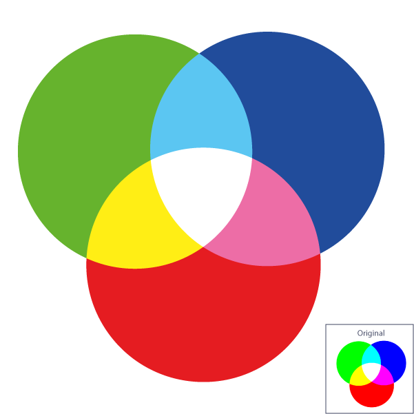
A conversion far away
That one occured while preparing images for this article. Starting with the original document in RGB color mode, we copy and paste it in a CMYK color mode document: colors were automatically converted. That’s far away because the primary colors of additive synthesis are out of the printing CMYK gamut.
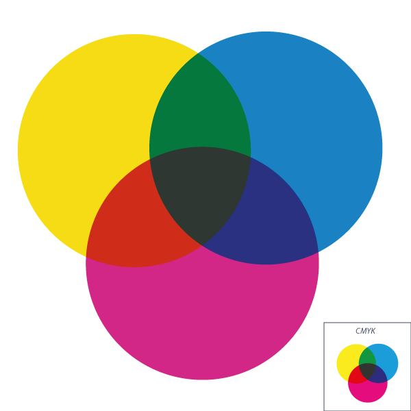
Pantone Solid is not equal to CMYK!
For this image, we used some Pantone Solid basic colors, the ones closest to CMY. Even if we have saved it in CMYK, we see a difference with the mandalla of 100% of cyan, magenta and yellow, especially for the blue that is darker!
Even in the formula guides, we see on swatches that their equivalent ain’t at 100% of pigments. To be closer of the CMY with its Solid basics, Pantone formulas use a translucid white in their mixture. To come close of the cyan use in digital, 75% of composition is that white! (As it’s translucid, pigments of color items will pass through, so even if the formula includes white translucid ink, we need an opaque white underlayer for colored items!)
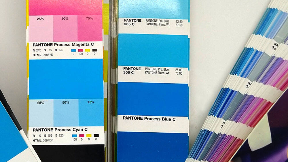
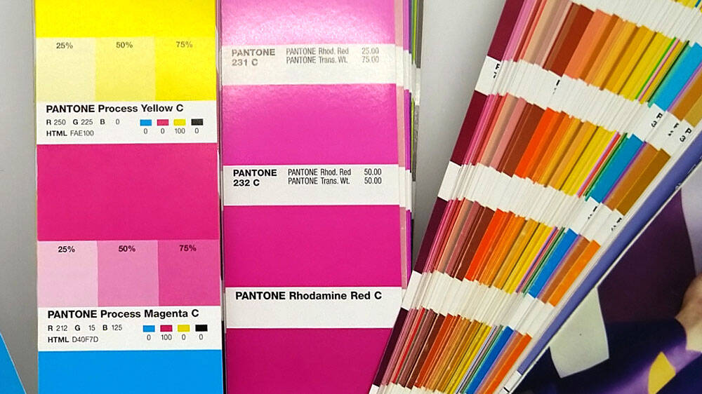
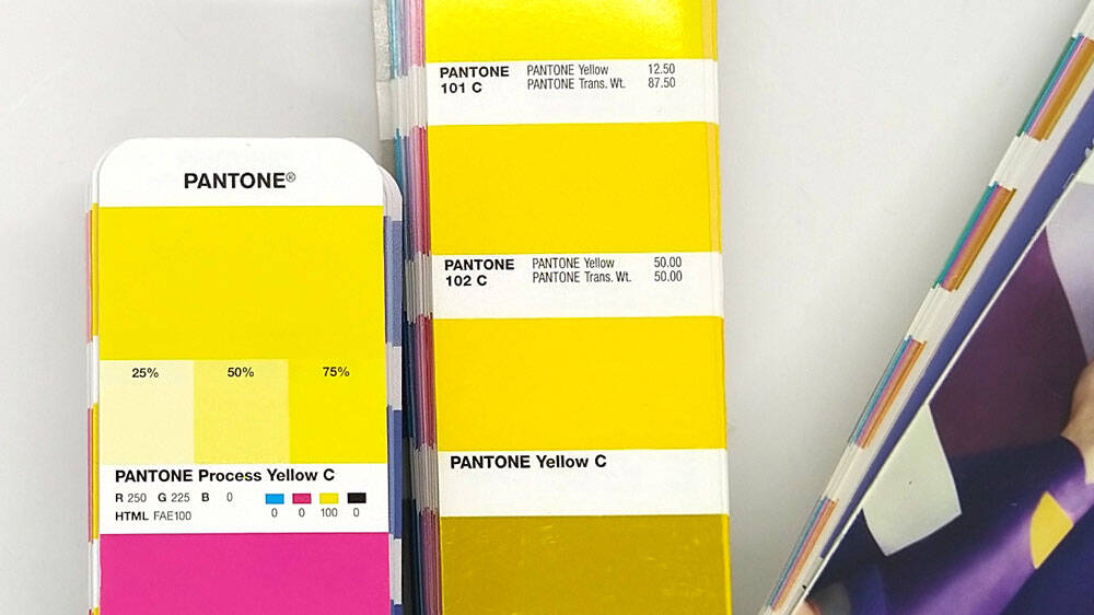
In subtractive synthesis, we can use different color pigments. If we add color out of the available spectrum produced by the 3 basics (cyan, magenta, yellow), it extends possible color field. As Pantone uses 18 basic colors, it can produce colors that are out of CMYK gamut.
Colors in CMYK and Pantone are not made from the same basics, so we must convert it. Pantone basics don’t produce the same color field: that’s why we say we convert as close as possible!
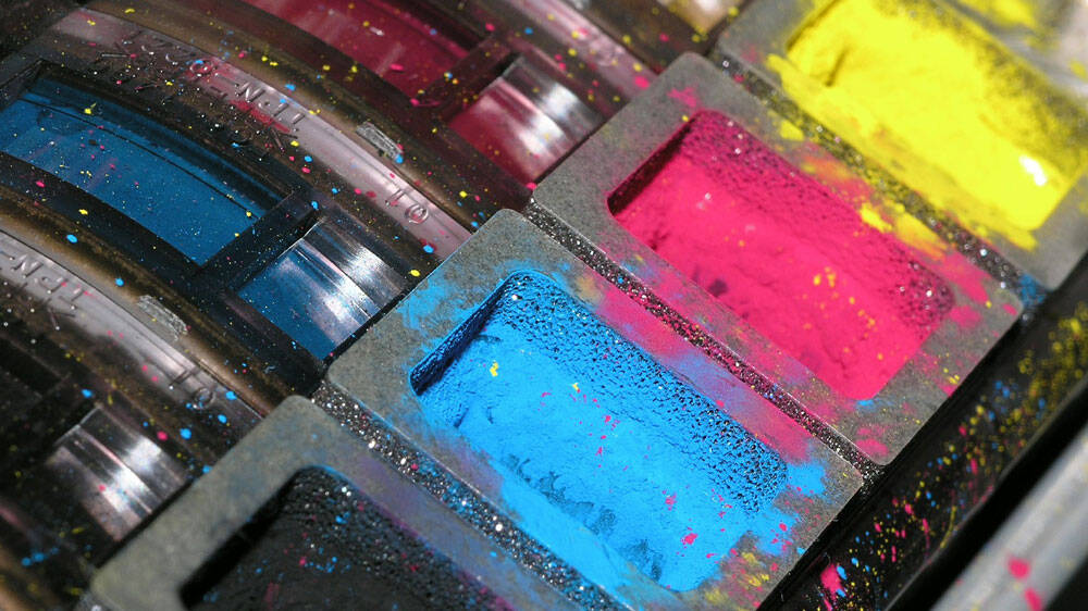
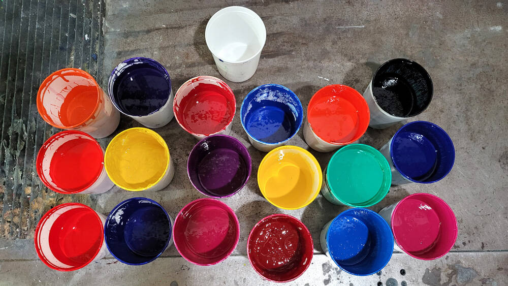

Ideal is not what occurs in practice!
Ideally, we would rather have that bright cyan for our CMYK printing. But the cyan in digital also absorb a part of green and blue rays, and not only the red lenghtwaves: so it’s more like a blue.
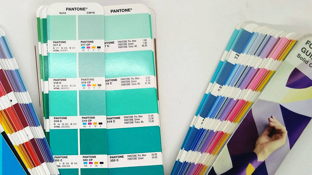

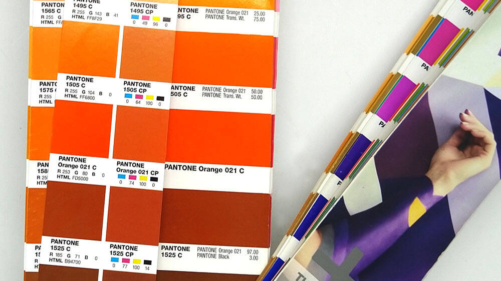
We saw that Pantone has a larger gamut than CMYK, because it works with its 18 basic colors and a translucid white. If you check on charts that make Pantone and CMYK swatches next to each other, you will see that Pantone offers larger and brighter possibilities in turquoise: adding its Pantone green and translucid white to its Pantone process blue extends possibilities. As we know that digital cyan is more blue than green, we can expect to see impossible reachable color in that area when converting to CMYK.
And even Pantone doesn’t reach that bright cyan, whatever guide is used. That bright cyan pigment that should absorb only 100% of red lenghtwaves is not only hard to find, but doesn’t exist at all! (That’s why you won’t see paint that bright too!)
Now, you know that because of the different Pantone basics, some colors are difficult or impossible to reach in CMYK: orange colors are one of those because their brightness! But, sometimes you may even be surprised in unexpected ways with colors less bright, like in purple area!
To remember!
RGB is about lights: so it’s element for computer, television!
Pantone and CMYK are based on different basic colors. Different pigments: different formulas, so a conversion, as close as possible, must be done if you wanna print your Pantone color design on CMYK!

